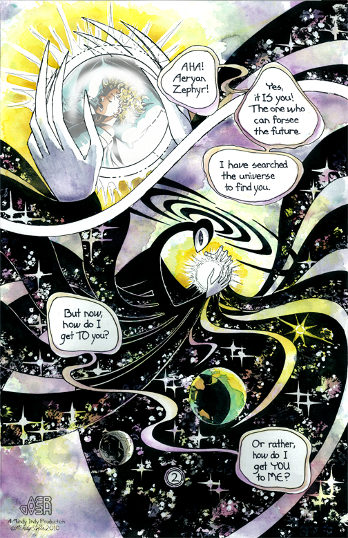
 I surprised myself with how well this page turned out :) Masking fluid and white out are awesome. Sparkly rainbow outer spaaaace!
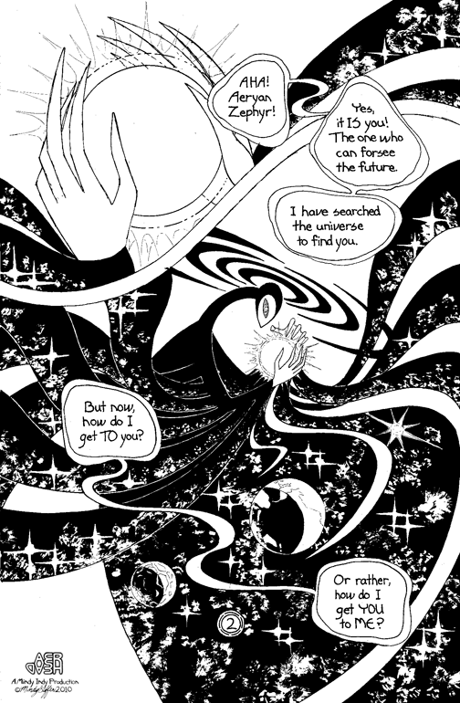
Special thanks to my friends at Drawbridge - I inked this page at their studio. I put their blog in my blogroll to the right. I also learned something very interesting when I was there about "dot gain." Take a look at the black and white line art of page 2:
Look at the black strips coming from the character's right arm - they are separated by very thin white lines. I learned that the lines may disappear in the printing process due to dot gain! Dot gain is when ink spreads out a little when it's laid down on paper. The fact that the art is shrunken down for printing would also diminish the lines' visibility. So, in Photoshop, I widened the lines, as you can see in the final piece. The more you know!
PS: For some reason the email notifications for my mailing list seem to come a day late - I'll look into that!
