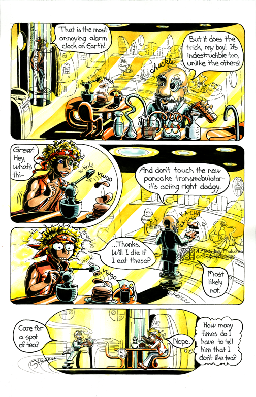
 There are so many things to say about the making of this page. My main struggle was the setting. I started to draw the page and was like "Oh crap, I have to draw their kitchen!" I had to realistically think of what kind of apartment they live in like an interior designer. I know what it looked like from the outside (see the left cone structure on page 1) but I hate drawing interiors! I'll get better at it the more I just do it, though.
I started with how I wanted the characters to interact. This is Dr. Pipsy's intro, so I wanted a close up of him and then Aeryan entering in the background. I wanted their environment to be more realistic, so I looked around my own kitchen and thought of futuristic versions of the appliances. But all those little details took forever to draw and then ink! Also, there was the problem of the background getting too busy when I inked it. In the top panel, Pipsy has lots of gadgets in the foreground and I didn't want the background to compete with them, so I didn't put any spot blacks in the furthest kitchen clutter. Spot blacks are the filled in black areas of a comic page. I usually looooove putting lots of spot blacks in my comics, but in this page they didn't fit the background well.
Another interesting note is Pipsy's dialogue - he's an Englishman! I looked up American English vs. British English online and even asked my friend Ariel who's studying abroad in London for suggestions. One difference is using words like well, right, and jolly in place of "very." And you can bet the trousers off your bum you'll see spellings like colour and aeroplane in the future ;)!