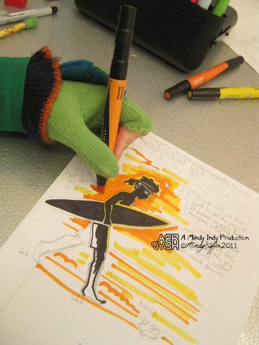
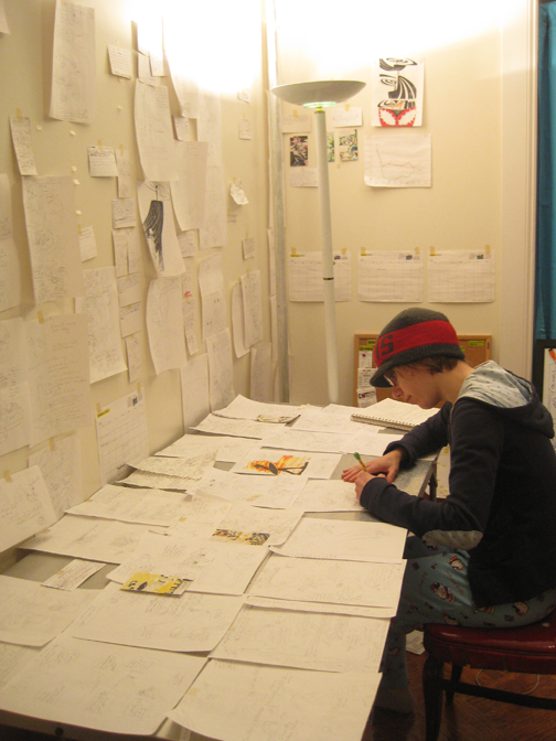
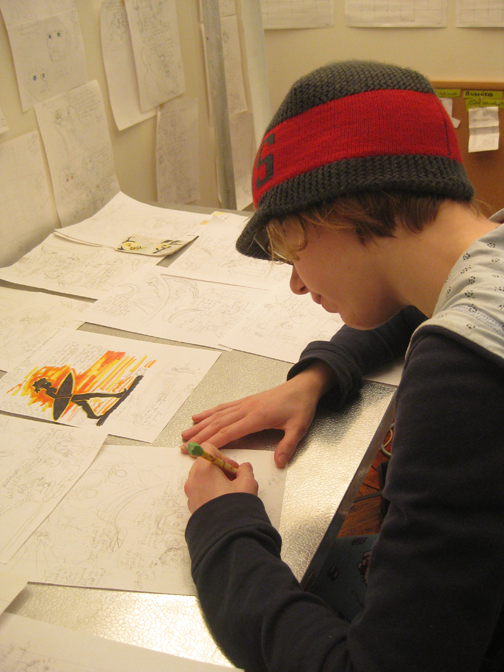
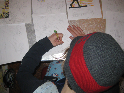
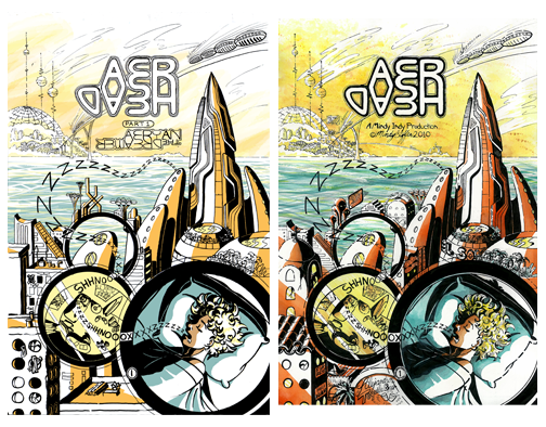
 Here's a little about the process of how I did the first page, and I'll answer last week's question at the same time!
1. The left page is colored by computer, whereas the right one is water color.
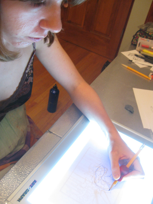
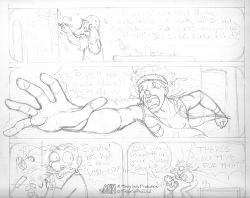
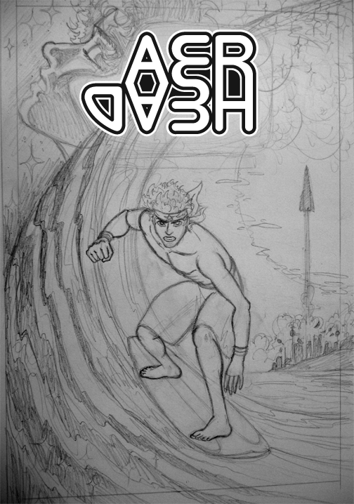
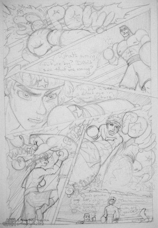
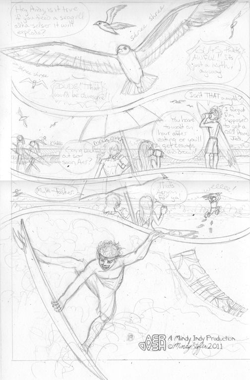
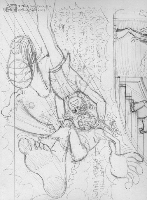
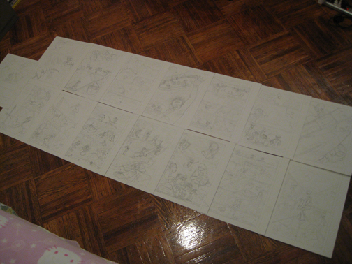
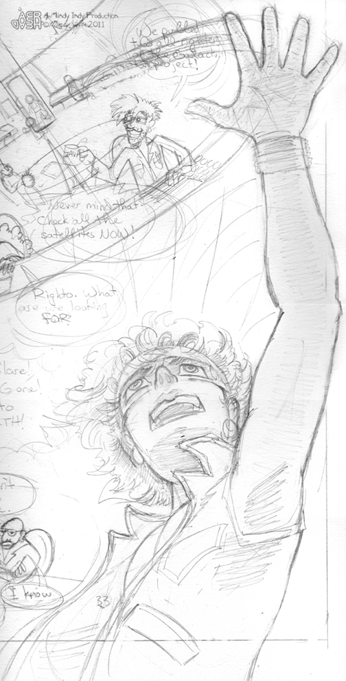
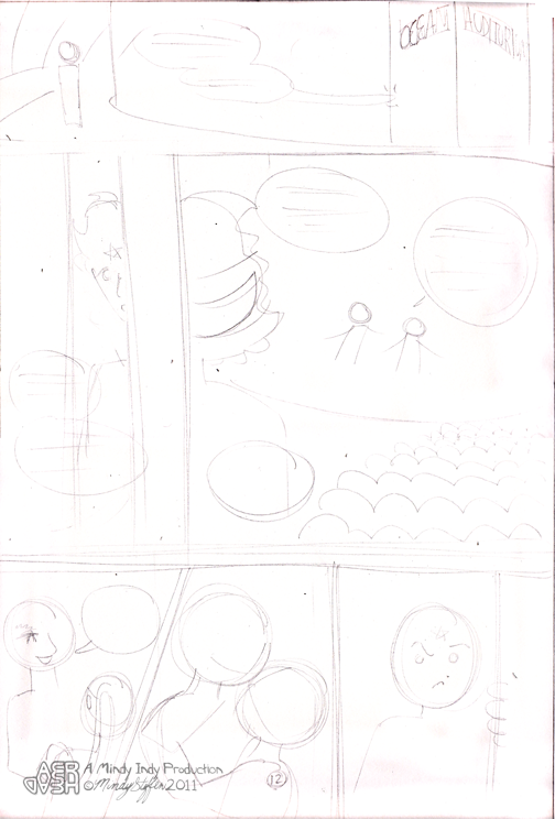
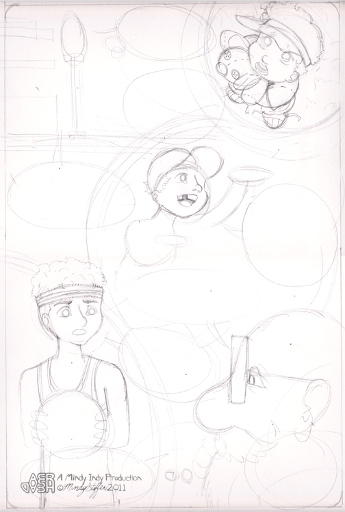
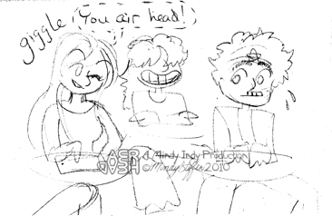
Now, backing up a bit, why did I color this twice? Backing up even further, I usually draw directly on the comic board, but I was inspired by some people in my class who used transfer paper to save their drawings (instead of inking over them). I've been told by various people that my drawings are better than my inking skills, so I wanted to save it. First, I drew the page on newsprint, as shown here:

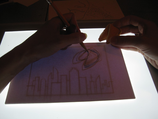
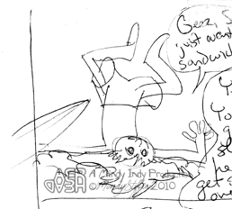
Then, I traced it on transfer paper to transfer it to the comic board:

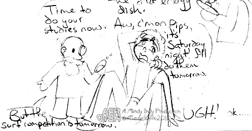
It kind of looked like a blue print! Then I inked it on the board:

But then I realized if I wanted to use water colors, I had done the page on the wrong paper. EPIC FAIL. I didn't think ahead to the coloring process. I really wanted to use water color because it was a strong aspect of my previous comics, but it would buckle the current paper and pieces may start to rub off. So I tried coloring on the computer:

And this looked fine.... but it just didn't feel RIGHT. And it looked like coloring I'd seen in other comics before. So I took the original drawing and REtraced it onto better paper (vellum bristol), RE-inked it, and finally water colored it, ending up with this:

All in all, I do NOT recommend the transferring process. True, it's cool to keep the drawing instead of inking over it, but it's totally not worth the time and AGGRAVATION. Although, if I hadn't drawn it on another paper, I wouldn't have been able to transfer it a second time to another board... Anyway, the rest of my pages won't involve this ridiculously insane process - I was just trying out something new. I hope I can save some poor soul from making the same mistake.
Another thing that I changed when transferring was:
2. Different buildings in the foreground and mid-ground.
The story begins in the futuristic city of New San Diego. But in my first draft, the buildings didn't look... San Diego-y enough, even for it's future. My sister lives in San Diego so I've been there many times. I tried to incorporate the Mexican influenced architecture more in version 2. Some have also said that the city looks more like San Francisco, but there's a reason for that on page 9.
3. Replaced "Part 1 Aeryan the Dreamer" with "A Mindy Indy Production" and my signature.
At first I tried dividing my story up into little parts of 4 or 5 pages, but the end format will be a graphic novel, so the "parts" seemed unnecessary. That, and having a title page so often seemed kind of ridiculous.
4. I made a black outline on the title (version 2).
Not sure how noticeable these next two are to others when scaled down on the computer:
5. I made a broken outline on the shiny parts of buildings and other things (version 2).
6. I gave Aeryan's hair more texture lines (version 2).
7. I added another bridge and more city on the smallest island in the background.
So those are the major changes! There are countless smaller details too - one of my friends also noticed I had added a new sign in place of some buildings.
Stay tuned for page 2!


