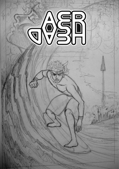
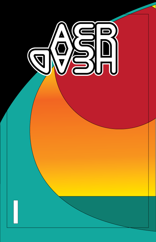
Back to drawing more AER HEAD! I've been sketching thumbnail tests of the cover for awhile, and decided on the layout. I wanted the cover to have lots of important points that occur in the graphic novel. Aeryan is dreaming of the future up in the left corner, and his dream merges with the waves (so the rest of the cover is his dream). He's surfing in the middle, but with a look of determination because near the end of the novel he has to warn people of the solar flare (giant sun on the right). You know how some covers just have a big picture of the main character looking cool, but not really doing anything? I want all my covers to have a definite purpose. Also, all the artwork will look the same INSIDE as it does on the cover! My biggest disappointment in picking up a cool looking comic is that it has an awesome cover, but the inside looks nothing like the cover and is black & white with a crappier art style. Aer Head will NOT be like that!


